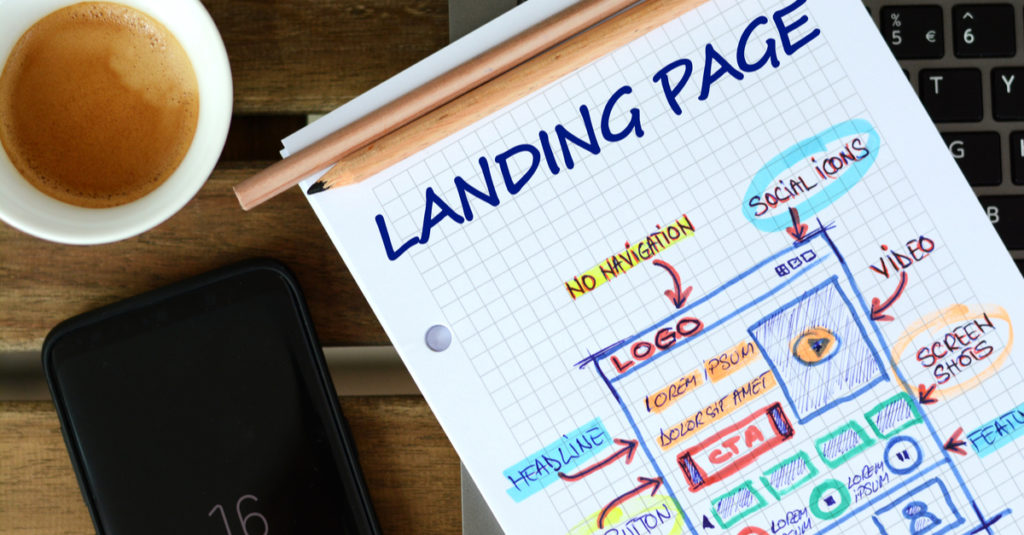
Whether you’re a ppc marketer, copywriter, entrepreneur or ecommerce business owner, you can benefit from a strong landing page that can convert.
Your landing page is where prospects land after clicking on your ad, email, or social media post.
The goal of a good landing page is to focus your attention on completing one goal. If it does this correctly, you can make money.
Even the best copywriters, media buyers, and ppc marketers can get absolutely wrecked by a bad landing page.
If your landing page is weak, you may be costing yourself hundreds or thousands of dollars in wasted time and ad spend.
Sending traffic to a bad landing page experience is like throwing a tennis ball at a brick wall!
It’s just going to bounce.
And if your traffic bounces, that means it’s not converting.
If your traffic is not converting, you won’t see a return on your ad spend.
If you are not seeing a return on ad spend you’re not making any money!
And if you’re not making money you’re not making any sense, playa!
So how do you improve your landing page?
What factors can make or break your conversions?
Well, in this article you will discover the best 7 landing page practices that will keep you from holding that cardboard sign on the side of the road that says “Need money for food.”
Let’s get into it.
Attention Ratio
Attention ratio is the number of links on a page versus the different campaign goals. On a landing page you typically would want a 1:1 ratio. Every link that doesn’t lead to the campaign goal is leaking money.
If you visit a good landing page you may sometimes see there are no navigation elements to click to another page. This keeps you from leaking out of the funnel and focuses your attention toward the call to action instead.
Call to Action
If you are familiar with the A.I.D.A formula, then you know this is part of the emotional customer journey most people take on their path to purchase
A call to action is a tool that can be used in the action phase of that journey.
It’s not enough to just build Awareness, Interest and Desire. You must also inspire Action!
And you do this by telling your prospect exactly what to do.
This could come in the form of a button, link text, or a sentence telling someone to call.
No matter the format, the whole point is to get people to take action.
To do this make sure you tell them what they are getting and speak directly to them.
Never use words like “Submit” or “click here.”
Your prospects want to know what you are doing for them and what they get once you ask them.
Message Matching
Message matching is when you match the message of your ad on your landing page. If your user clicked on an ad that said “Brenda’s best pancakes” and the headline of your landing page was “Tom’s best waffles” that will confuse your prospects.
If your prospects are confused, it creates anxiety which makes them less likely to convert, or worse…
Leave!
You need to reinforce your landing page with a matching headline to quickly let your prospect know they made the right click.
Features Vs. Benefits
Let’s start this by saying people buy benefits not features. People use features to compare commodities but it’s the benefits that trigger the emotional pull that gets them to buy.
Many landing pages make the mistake of endlessly listing off features without telling people about these benefits. This is a huge mistake! You need to combine both.
Unbounce said it best!
“A feature is a part of your product or service, while a benefit is the positive impact it has on your customer.”
A feature provides the proof to the promise while the benefits solve the problem and give the pitch.
When writing the copy for a good landing page, remember to combine your features and benefits.
Directional Cues
Did you know just adding an arrow point to your CTA may increase your conversion? 46.1% percent of people will spend more time looking at your visual cues than your site content.
These visual cues help guide people around your web page and point them in a certain direction.
There are 4 types of visual cues you can use:
- White-space
- Eye-direction
- Arrows/Linear
- Encapsulation
Be sure your landing page includes directional cues to help guide your prospects through your content.
And no, that’s not a Google adsense ad above!
It’s a good example of how to use directional cues to focus your prospects’ attention.
Speed
What’s the saying… Speed kills!
Well, this is true, but when it comes to landing pages the slower you go, the more sales opportunities you kill!
Did you know 53% of people will abandon your site if it doesn’t load in three seconds?
You could be losing 53% of possible sales faster than Thanos can make your prospects disappear. Oh, SNAP! Get it? Because Thanos…never mind.
So, no matter how great your page and copy is, make sure you test and confirm it’s loading fast enough.
Social proof
“We view a behavior as more correct in a given situation to the degree that we see others performing it” According to Dr. Robert Cialdini, author of the International best seller influence.
Meaning the more you see other people do something, the more likely you’ll think it’s the right thing to do.
Adding testimonials, review, or badges can be a great way to increase trust and lower anxiety which will help you convert more prospects into customers.
All in all, I hope you enjoyed these 7 landing page tips.
Till next time.
Cheers M8!
~J
P.S. – If you are looking to improve your web copywriting skills and learn how to increase your sales online, check AWAI’s Web Copywriting Course.


